About The Brand
A high quality and natural handmade soap produced by Bedouin women from the Negev region in Israel. Over the years women in the Negev are finding economic independence and becoming career women.
Behind The Logo
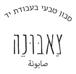
I chose to name my brand “סבון s’a-buu-ne” (meaning soap in Arabic) because it is incorporating both the Hebrew and Arabic scripts and adds a multicultural and authentic touch.
It reflects the essence of my brand, emphasizing the connection between different cultures and linguistic elements. This is resonate well with my target audience, especially those who appreciate cultural heritage and traditional practices.

Typography, Illustration and Colors
for the main logo I choose Amatic SC font, I found that font simple and readable with clean strokes but with interesting characteristics.
The alternative Hebrew font is Artzi v2 FM, a sans-serif typeface.
Despite its simple and clean appearance, it features rounded and fresh curves that contribute a distinctive touch.
For the Arabic font I choose a system font called Adobe Arabic because not everybody familiar with Arabic so I wanted it to be readable and simple because the Arabic letters are already have curviness and oriental look.

Colors
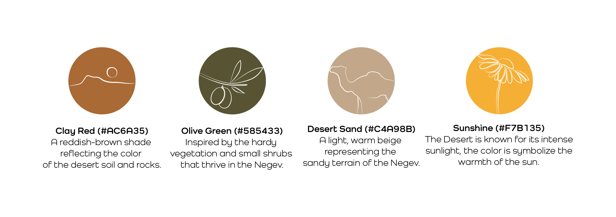
I Choose to combine colors that we can find in The Negev region, located in Israel.
The Negev region have a unique and stunning color palette influenced by its rocky landscapes, sand dunes, and vibrant flora.

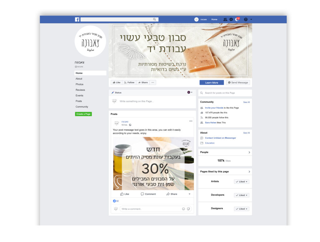
Social Media


